Installation
composer require devletes/filament-timeline-viewNo plugin registration needed — the service provider auto-loads, registers the Table macros, and registers the CSS asset with Filament’s asset system. Publish the asset once after install:
php artisan filament:assetsUsage
The package adds two macros to Filament\Tables\Table:
| Macro | Renders |
|---|---|
->asTimeline() | Single-column vertical timeline. Cards on the right of the line, dots on the left. |
->asDoubleSidedTimeline() | Centre line with cards alternating left/right. Collapses to single-column below 768px. |
You compose the timeline using Filament’s standard table API: ->query(), ->columns(), ->groups(), ->actions(), ->paginated(). Just swap ->columns() for TimelineEntry::make() and call one of the timeline macros at the end.
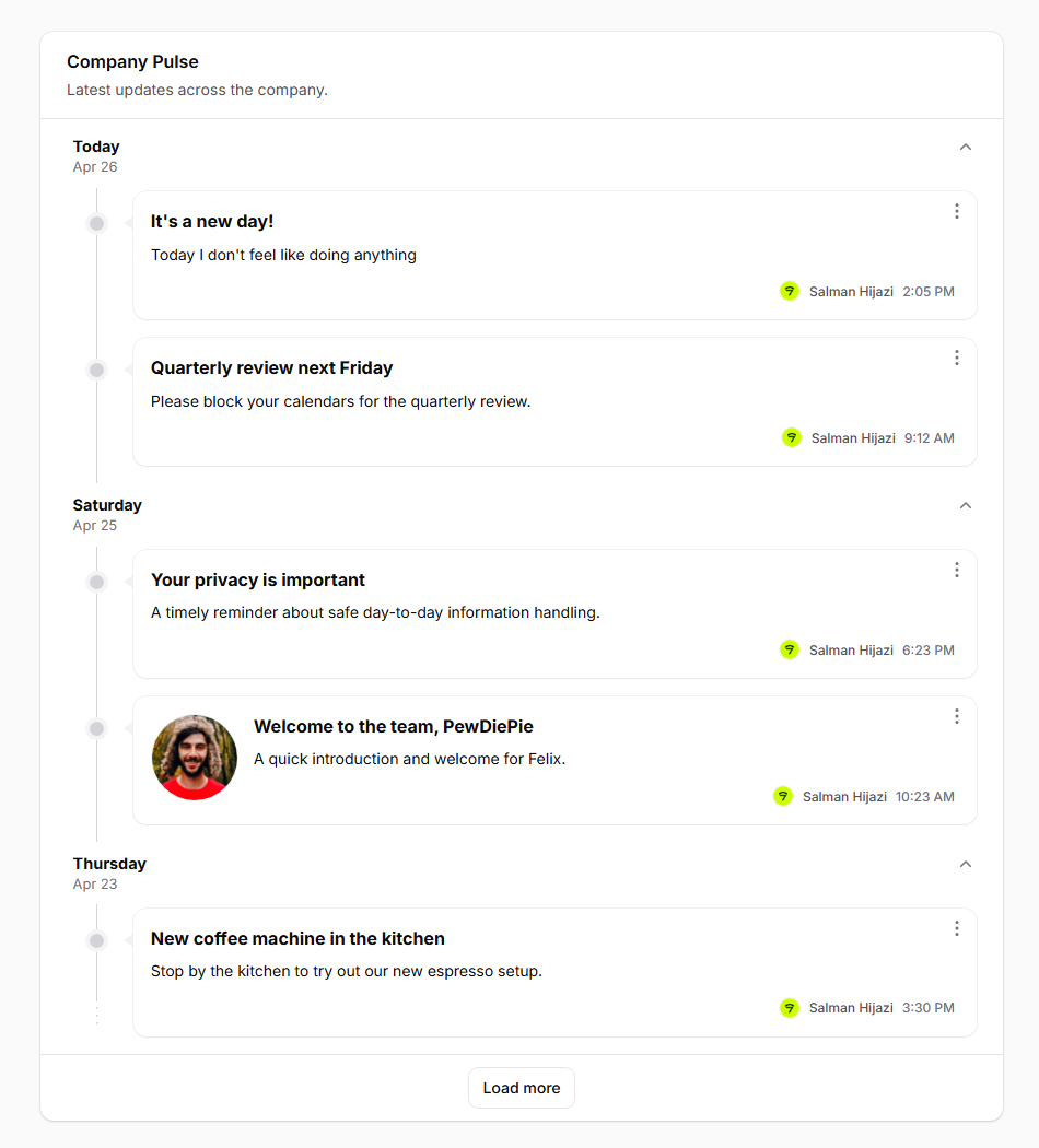
Resource list page
use Devletes\FilamentTimelineView\Tables\Columns\TimelineEntry;
use Filament\Actions\ActionGroup;
use Filament\Actions\ViewAction;
use Filament\Actions\EditAction;
use Filament\Actions\DeleteAction;
use Filament\Tables\Grouping\Group;
use Filament\Tables\Table;
class ListPulses extends ListRecords
{
protected static string $resource = PulseResource::class;
public function table(Table $table): Table
{
return $table
->columns([
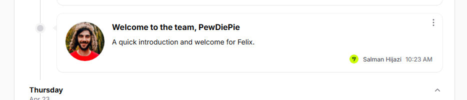
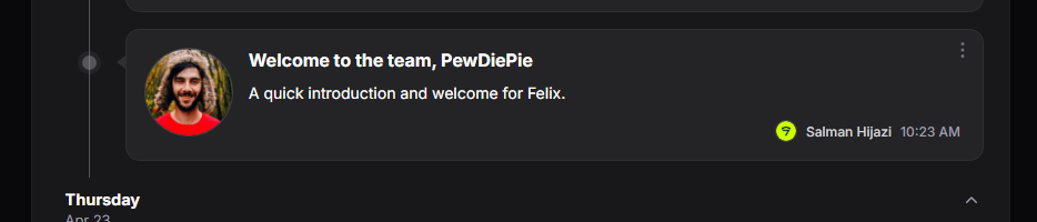
TimelineEntry::make()
->title('title')
->content('body')
->image('hero_image_url')
->author('author.name', 'author.avatar_url')
->time('published_at'),
])
->defaultGroup(Group::make('published_at')->date())
->recordActions([
ActionGroup::make([
ViewAction::make(),
EditAction::make(),
DeleteAction::make(),
]),
])
->paginated([10])
->asTimeline();
}
}| Light | Dark |
|---|---|
 |  |
Dashboard widget
TimelineEntry is a Tables column, so anywhere you can build a Filament\Widgets\TableWidget, you can render a timeline:
use Devletes\FilamentTimelineView\Tables\Columns\TimelineEntry;
use Filament\Tables\Grouping\Group;
use Filament\Tables\Table;
use Filament\Widgets\TableWidget;

class CompanyPulseWidget extends TableWidget
{
    protected int|string|array $columnSpan = 'full';

    public function table(Table $table): Table
    {
        return $table
            ->heading('Company Pulse')
            ->description('Latest updates across the company.')
            ->query(fn () => app(EmployeeDashboardService::class)
                ->pulseFeedQuery(Filament::auth()->user())
                ->with(['author']))
            ->defaultSort('published_at', 'desc')
            ->columns([
                TimelineEntry::make()
                    ->title('title')
                    ->content('excerpt')
                    ->image('hero_url')
                    ->author('author.name', 'author.avatar_url')
                    ->time('published_at'),
            ])
            ->defaultGroup(Group::make('published_at')->date())
            ->recordActions([
                Action::make('view')
                    ->icon('heroicon-m-eye')
                    ->url(fn ($record) => PulsePostResource::getUrl('view', ['record' => $record])),
            ])
            ->paginated([5])
            ->asTimeline();
    }
}
Embed in a custom Dashboard page via Filament\Schemas\Components\Livewire:
use Filament\Schemas\Components\Livewire;
public function content(Schema $schema): Schema
{
return $schema->components([
Livewire::make(CompanyPulseWidget::class)->columnSpan('full'),
]);
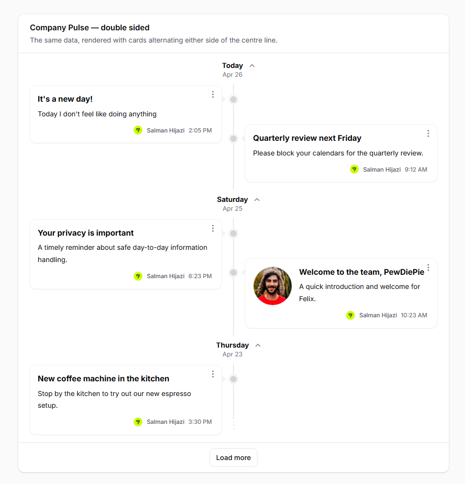
}Double-sided variant
Swap ->asTimeline() for ->asDoubleSidedTimeline(). Cards alternate per date — the first item of every date always lands on the left, so single-item days stay consistent. Below 768px the layout collapses to a single chronological column.
return $table
    ->columns([TimelineEntry::make()->...])
    ->groups([Group::make('published_at')->date()])
->asDoubleSidedTimeline();| Light | Dark |
|---|---|
 |  |
The TimelineEntry column
TimelineEntry::make() is a layout column (extends Filament\Tables\Columns\Layout\Component). It produces the inner content of one card. The .ftv-card chrome — border, padding, dot, caret, and the actions kebab — is provided by the package blade and applied to every record regardless of which layout column you use.
Field setters
| Method | Purpose |
|---|---|
->title($field) | The card title. |
->content($field) | The card body / excerpt. Newlines render as <br>. |
->image($field) | A circular image rendered to the left of the body. |
->author($name, $avatar = null) | A small avatar + name in the card footer. |
->time($field, $format = 'g:i A') | A small time stamp in the footer. Carbon-parsed. |
| Light | Dark |
|---|---|
 |  |
Each setter accepts either a string field path (resolved via data_get($record, $path)) or a Closure receiving the record:
TimelineEntry::make()
    ->title('title')                                          // dot-notation field path
    ->content(fn ($record) => strip_tags($record->html_body)) // closure
    ->image(fn ($record) => $record->cover?->getUrl('thumb')) // closure
    ->author(
        'author.name',                                         // string path
        fn ($record) => $record->author?->getFilamentAvatarUrl(), // closure
    )
    ->time('published_at')
For time(), a closure may return a Carbon instance (formatted via translatedFormat($format)) or a pre-formatted string (used as-is).
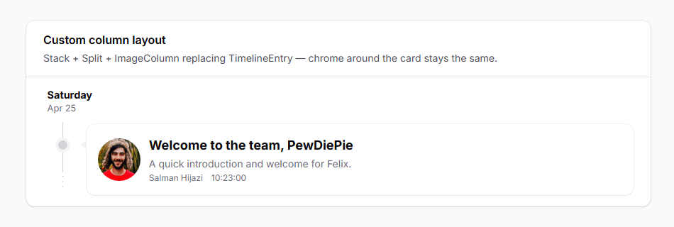
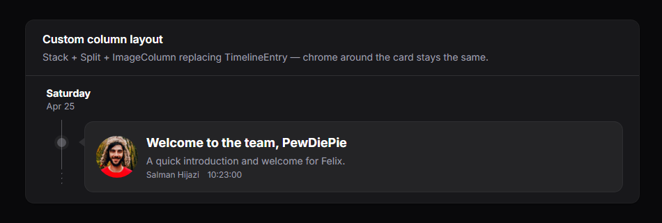
Custom layouts
TimelineEntry is opinionated. If you need a different inner structure, drop it for Stack::make([...]) (or any other column-layout component) and the timeline will still render the dot, caret, card chrome, and actions kebab around it:
use Filament\Tables\Columns\ImageColumn;
use Filament\Tables\Columns\Layout\Split;
use Filament\Tables\Columns\Layout\Stack;
use Filament\Tables\Columns\TextColumn;

->columns([
    Stack::make([
        Split::make([
            ImageColumn::make('cover_url')->circular()->size(60)->grow(false),
            Stack::make([
                TextColumn::make('title')->weight('bold')->size('lg'),
                TextColumn::make('summary')->color('gray'),
                Split::make([
                    TextColumn::make('author.name')->size('xs')->color('gray'),
                    TextColumn::make('published_at')->time()->size('xs')->color('gray')->alignEnd(),
                ]),
            ]),
        ]),
    ]),
])| Light | Dark |
|---|---|
 |  |
Date grouping
Use Filament’s standard Group API. When the group is a date (->date()), the package renders a date header above each group with this resolution:
- Today →
Today(translated) - Otherwise → the weekday name (
Wednesday,Tuesday, …) - A second line under the weekday shows
M j(e.g.Apr 8), with the year appended for dates outside the current year.
->defaultGroup(Group::make('published_at')->date())Pass the Group instance straight to ->defaultGroup(...) — no need for a separate ->groups([...]) array unless you want the group selector in the toolbar (which a timeline rarely does, since the grouping is the whole point).
Newest-first ordering. Filament’s date grouping orders ascending by default, which puts Today at the bottom. For a typical chronological feed you’ll want to flip it on the
Group:->defaultGroup( Group::make('published_at') ->date() ->orderQueryUsing(fn ($query) => $query->orderByDesc('published_at')) )
| Light | Dark |
|---|---|
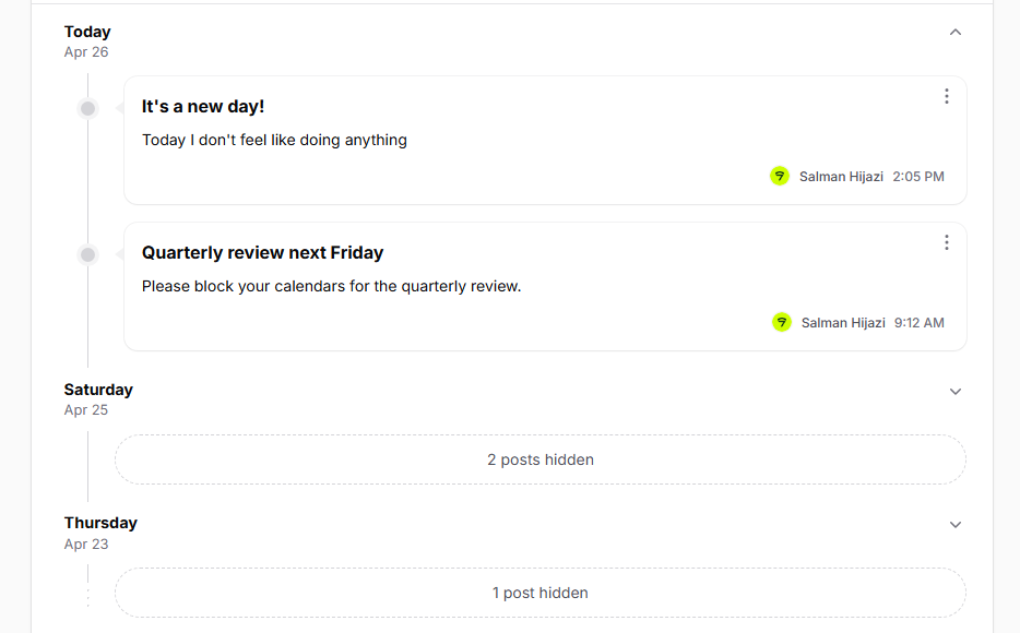 | 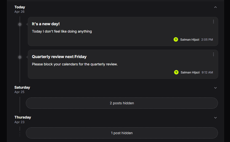 |
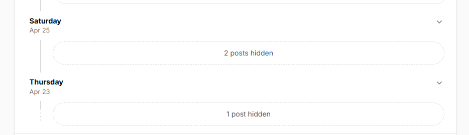
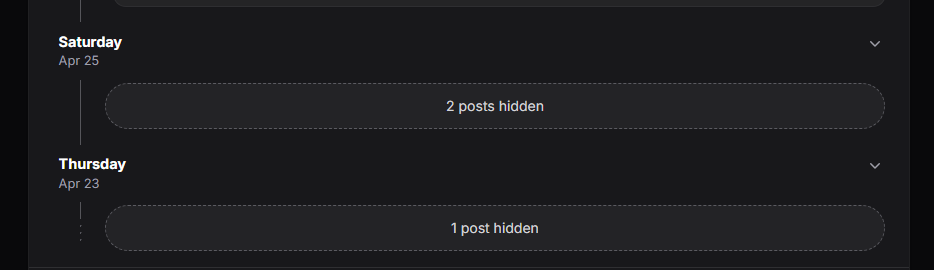
Day-group collapse (opt-in)
Day groups are not collapsible by default. To make them collapsible, call ->collapsible() on the Group:
->defaultGroup(Group::make('published_at')->date()->collapsible())When enabled, each date header gets a chevron toggle that hides/shows the day’s cards via Alpine.js (no Livewire round-trip). Collapsed groups show a translated “N posts hidden” pill (collapsed_summary translation key) in place of the cards.
| Light | Dark |
|---|---|
 |  |
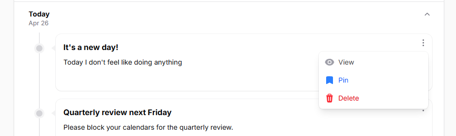
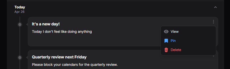
Per-card actions
Every record gets a single kebab dropdown in the top-right of the card. The package consumes the table’s recordActions(...) config and always renders exactly one ActionGroup per card:
- If you pass a single
ActionGroup→ it’s used as-is, preserving your->color(),->dropdownPlacement(), and other settings. - If you pass a flat array of actions, multiple action groups, or a mix → the package extracts every underlying action via
getFlatActions()and wraps them in one freshActionGroup::make([...])->color('gray').
Either way the visual is one kebab. Hidden actions (->hidden() / ->visible()) are filtered per record before rendering.
->recordActions([
    ActionGroup::make([
        ViewAction::make(),
        EditAction::make()->color('primary'),
        DeleteAction::make()->requiresConfirmation()->color('danger'),
    ])->color('gray'),
])
Action click handlers use Filament’s standard mountAction(...) flow, so ->action(fn ($record) => ...), modals, notifications, and forms all work as they would on any normal table.
| Light | Dark |
|---|---|
 |  |
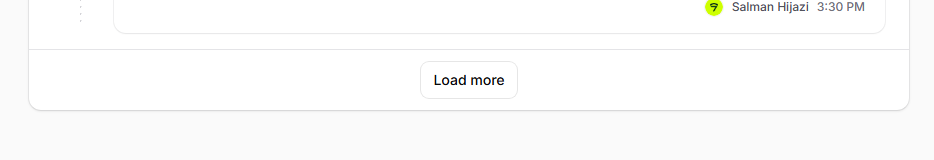
Pagination → Load more
->paginated([N]) enables pagination. The package replaces Filament’s prev/next page links with a single Load more button that bumps tableRecordsPerPage by N on each click. paginated([5]) shows 5 rows initially and adds 5 more per click.
->paginated([5])The package renders only the Load more button — Filament’s stock per-page selector and prev/next links don’t appear. Pass a single-value array like
[5]rather than the multi-value form ([5, 10, 25]) — only the first integer is used as the increment, the rest are ignored.
The button hides automatically when the underlying paginator’s hasMorePages() returns false. It briefly disables and shows a loading spinner during the request.
If you want vanilla page-link pagination, leave ->paginated(...) set but skip the timeline macro — you’ll get Filament’s default rendering.
| Light | Dark |
|---|---|
 |  |
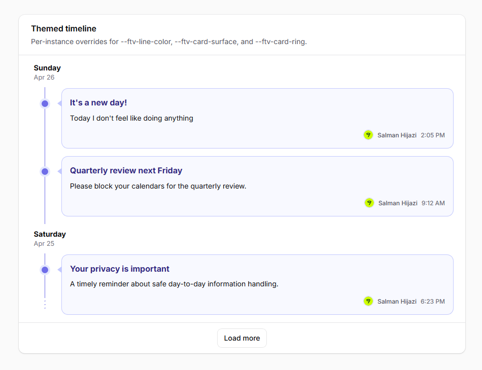
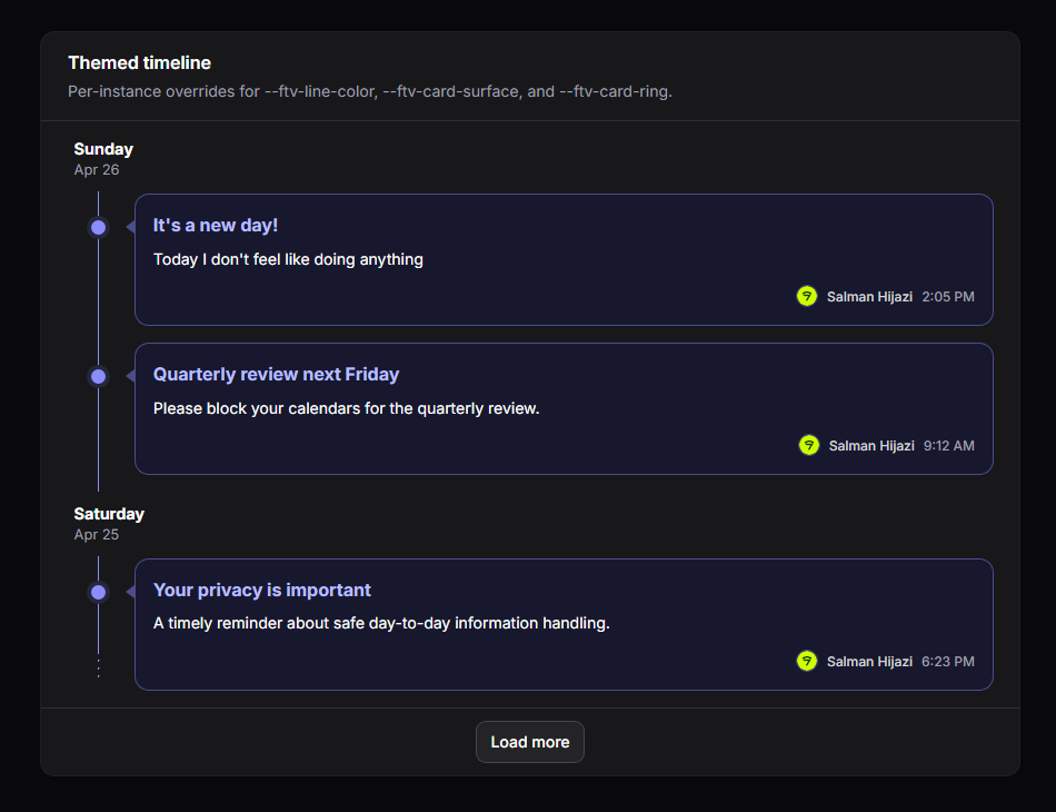
Theming
The package’s geometry — line position, card surface, dot colours, caret accent — is driven by a small set of CSS custom properties you can override without forking the stylesheet.
Root-level (.ftv-shell):
| Variable | Purpose |
|---|---|
--ftv-line-color | Vertical line, dots, and dashed terminator colour. |
--ftv-card-surface | Card background (also used as the “halo” around each dot). |
--ftv-card-ring | Card ring / border colour; also drives the caret colour. |
--ftv-hover-shadow-color | Card hover shadow. |
Per-group (.ftv-group-body):
| Variable | Purpose |
|---|---|
--ftv-line-x | Horizontal offset of the timeline line. Dots and carets derive from this. 1.7rem desktop, 0.65rem mobile. |
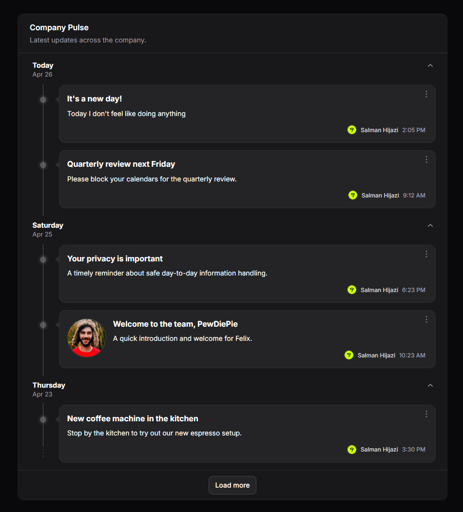
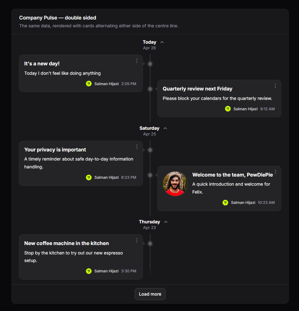
Dark mode automatically picks up adjusted values via .dark .ftv-shell.
To override per panel, add a rule to your panel’s theme CSS:
.fi-ta-timeline {
    /* Override container padding, e.g. flush against the section card. */
    padding: 0;
}

.dark .ftv-shell {
    --ftv-line-color: oklch(50% 0.04 240);
}| Light | Dark |
|---|---|
 |  |
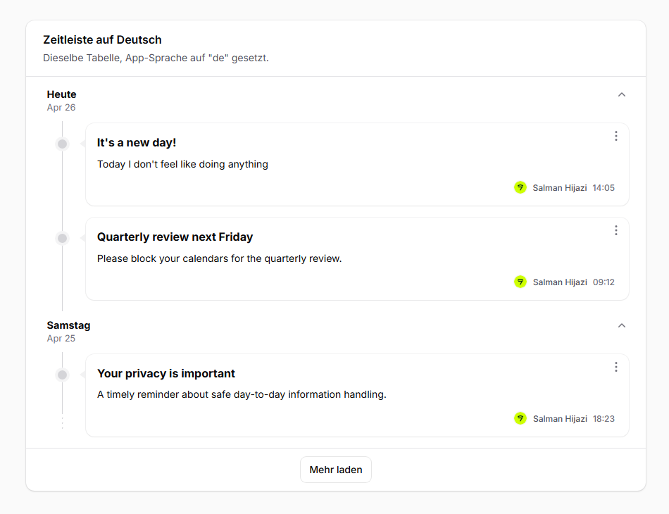
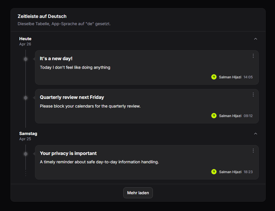
Translations
All user-facing strings go through trans('filament-timeline-view::timeline.*'). Weekday and month names use Carbon’s translatedFormat() which respects the app’s locale.
To customize strings or add locales, publish the language files:
php artisan vendor:publish --tag=filament-timeline-view-translationsThen edit or add files under lang/vendor/filament-timeline-view/.
Keys:
today— “Today” label shown when the group’s date is today.load_more— Load more button label.toggle_day— aria-label template for the collapse toggle (:dayplaceholder).collapsed_summary— pluralized “N posts hidden” shown in the collapsed state.empty_state.heading/empty_state.description— default empty-state copy. Override per-table via->emptyStateHeading(...)/->emptyStateDescription(...).
Ships with en and de out of the box.
| Light | Dark |
|---|---|
 |  |
Need something custom?
If you’d like custom features, extensions, or a tailored variant of this package built for your project, reach out at salman@devletes.com.