Orbit is a polished, dark-first Filament theme that reskins every component your Filament panel ships with — sidebar, topbar, sections, forms, tables, infolists, widgets, modals, and notifications. Designed for long working sessions, with light mode supported out of the box and zero changes to your app’s build pipeline.
- Drop-in plugin —
composer require,filament:assets, register the plugin - Self-contained CSS, no
@importinto your Vite or Tailwind pipeline - Phosphor icons swapped in for Filament’s defaults (toggleable)
- Custom HeroCard schema component for dashboard and resource pages
- Optional topbar date + weather trinket
- Opt-in orbit-themed Laravel mail templates with your primary color baked in
- Per-panel scoping — register on the panels you want, ignored on the rest
Pricing
Two licenses, both one-time purchases.
Standard
- Single-site license
- 1 year of updates
- Lifetime access to the version line
- Email support
Unlimited
- Unlimited sites
- 1 year of updates
- Lifetime access to the version line
- Priority email support
Purchase & activation
Orbit is a commercial package distributed via Anystack. Three short steps to get authenticated before you can install it.
1. Buy a license
Purchase a license here:
After checkout you’ll be prompted to activate your license by entering the domain you intend to use for your production environment — this is your activation fingerprint. You’ll also receive a confirmation email with your license key.
2. Authenticate Composer
Tell Composer how to authenticate with the private repository. The password is your license key and activation fingerprint joined with a colon — license-key:fingerprint:
composer config --global --auth http-basic.filament-theme-orbit.composer.sh "your-email@example.com" "your-license-key:your-fingerprint"For example, if your license key is 8c21df8f-6273-4932-b4ba-8bbc69a973fe and your activation fingerprint is yourcompany.com, you would run:
composer config --global --auth http-basic.filament-theme-orbit.composer.sh "you@example.com" "8c21df8f-6273-4932-b4ba-8bbc69a973fe:yourcompany.com"3. Add the repository
From your project root, register the Anystack-hosted repository in your composer.json:
composer config repositories.filament-orbit-theme composer https://filament-theme-orbit.composer.shComposer will now resolve devletes/filament-orbit-theme against the private repository when you run the install step below.
Installation
1. Require the package
composer require devletes/filament-orbit-theme2. Publish the CSS
php artisan filament:assetsThis copies Orbit’s pre-built stylesheet into your public/ directory. Re-run after every composer update to pick up theme changes.
3. Register the plugin
use Devletes\FilamentOrbitTheme\OrbitThemePlugin;
use Filament\Panel;

public function panel(Panel $panel): Panel
{
    return $panel
        // ...
        ->plugin(OrbitThemePlugin::make());
}
That’s it. The consuming app does not need to import Orbit’s CSS into its own theme. The plugin registers the compiled stylesheet via Filament’s asset manager, scoped to the panel where it’s registered — your other panels stay untouched.
Customization
All knobs are fluent methods on the plugin instance.
Primary palette
Orbit ships with a teal palette by default. Pass any 50–950 array to override:
OrbitThemePlugin::make()
    ->primaryColor([
        50  => '#...',
        100 => '#...',
        // ...
        950 => '#...',
    ]);
Phosphor icons
Phosphor icons replace Filament’s Heroicon aliases (sidebar toggles, user menu, action affordances, notifications, form action triggers) by default. Heroicons set explicitly via the Heroicon enum pass through unchanged — only Filament’s internal aliases are remapped.
OrbitThemePlugin::make()->phosphorIcons(false);              // keep Heroicons
OrbitThemePlugin::make()->phosphorIcons(style: 'duotone');   // bold, light, thin, fill, regular
Orbit components
HeroCard
A schema component for placing a flexible hero card at the top of dashboards or resource pages. Supports a heading, description, image, and a stack of primary/secondary actions.
use Devletes\FilamentOrbitTheme\Schemas\Components\HeroCard;

HeroCard::make()
    ->title('Welcome back, Salman')
    ->description('You have 3 pending approvals and 1 blocking ticket.')
    ->image('/img/hero.png')
    ->actions([...]);
The hero card can sit on dashboards, resource view pages, or anywhere else a schema is rendered.
Weather widget
Opt-in via fluent method:
OrbitThemePlugin::make()->dateWeatherWidget()Renders a small Monday, 27 Apr • ☀️ 52°F trinket inside the topbar, just after the sidebar toggle.
The authenticated user model exposes a getOrbitLocation(): ?array method that returns either coordinates or a city:
// Coordinates (no geocoding round-trip)
public function getOrbitLocation(): ?array
{
    return [
        'latitude' => 40.7128,
        'longitude' => -74.0060,
        'timezone' => 'America/New_York',
        'country_code' => 'US',
    ];
}

// Or a city (auto-geocoded, cached for 30 days)
public function getOrbitLocation(): ?array
{
    return [
        'city' => 'Berlin',
        'country' => 'DE',
        'timezone' => 'Europe/Berlin',
    ];
}
Temperature unit resolves country-aware (US, Liberia, Myanmar, Bahamas, Belize, Cayman Islands, and Palau get Fahrenheit; everywhere else gets Celsius), or you can force it with 'unit' => 'fahrenheit' / 'celsius'. Weather data comes from Open-Meteo’s free API — no key required — and is cached for 30 minutes. The widget early-returns silently when the user has no location or the API is unreachable, so it never throws into the request.
Sidebar footer
A custom footer slot is rendered into Filament’s SIDEBAR_FOOTER hook — a place for the theme switcher, sign-out, and any other persistent actions you want pinned to the bottom of the rail.
Mail templates
Opt-in orbit-themed Laravel mail markdown views — header, body card, button, panel, table, footer — all matched to the panel’s primary color.
php artisan orbit:install-mailThe command auto-detects your Orbit-enabled panel and reads its primary color, then publishes themed CSS plus blade overrides to resources/views/vendor/mail/. If you have multiple Orbit panels, name the one to read from:
php artisan orbit:install-mail --panel=adminTo skip panel detection entirely and pass a custom hex directly:
php artisan orbit:install-mail --primary=#1fc8c9Hex values are baked in at publish time, so re-run the install command whenever you change the panel’s primary color.
Activate globally in config/mail.php:
'markdown' => [
    'theme' => 'orbit',
    // ...
],
…or per-mailable:
return $this->markdown('mail.welcome')->theme('orbit');Logo. You can define the logo in your .env (with an optional dark variant):
ORBIT_MAIL_LOGO=https://example.com/logo.png
ORBIT_MAIL_LOGO_DARK=https://example.com/logo-dark.png
Or pass branding through the mailable’s view data — useful for multi-tenant apps where each tenant has its own logo, name, and URL. Values are captured at dispatch and survive the queue:
return new Content(
    markdown: 'mail.welcome',
    with: [
        'logo' => $this->tenant->logo_url,
        'logoDark' => $this->tenant->logo_dark_url,
        'brand' => $this->tenant->name,
        'brandUrl' => $this->tenant->url,
    ],
);
brand overrides config('app.name') in the header text, footer copyright, <title>, and <img> alt text. brandUrl overrides config('app.url') for the header link target.
Mail client compatibility. Dark mode is honored by Apple Mail, iOS Mail, and Outlook.com web; Gmail and Outlook desktop apply their own dark transforms, but the light treatment holds up under both.
Bonus
Guava Calendar Plus
If your panel uses guava/calendar-plus, Orbit automatically restyles the calendar widget — rounded day tiles, hatched out-of-month cells, pill-shaped events, and dark-mode tokens that match the rest of the theme. No extra config; selectors are inert when the package isn’t installed.
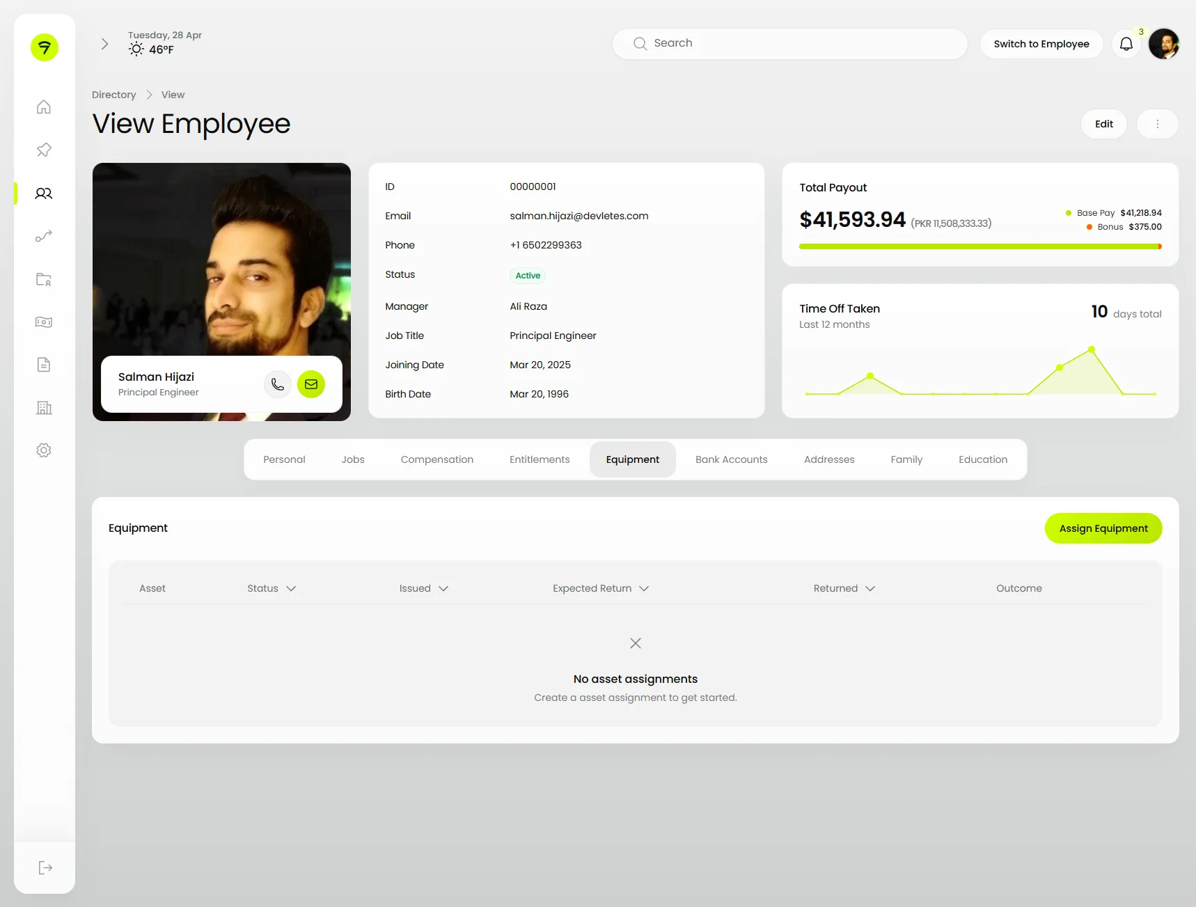
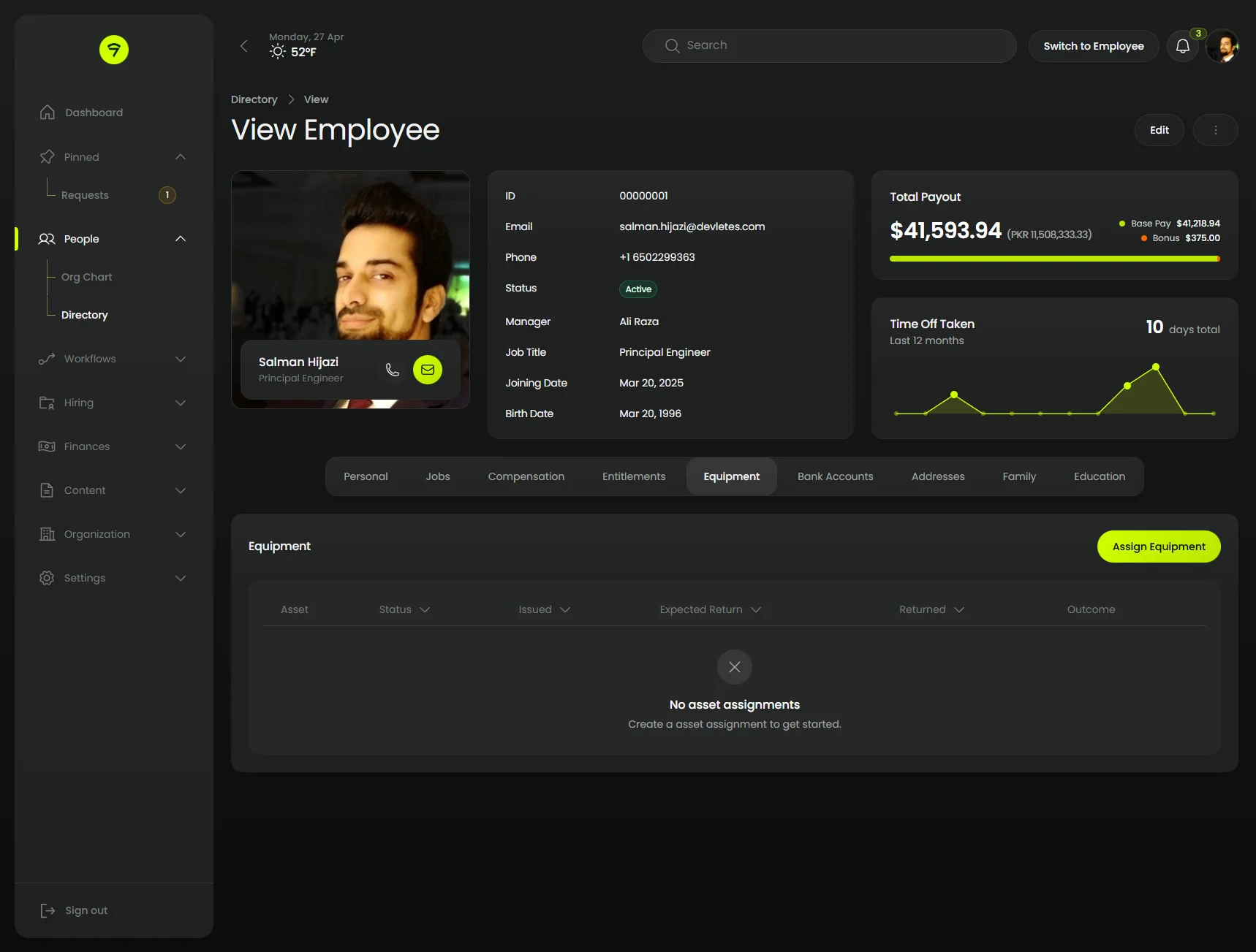
Screenshots
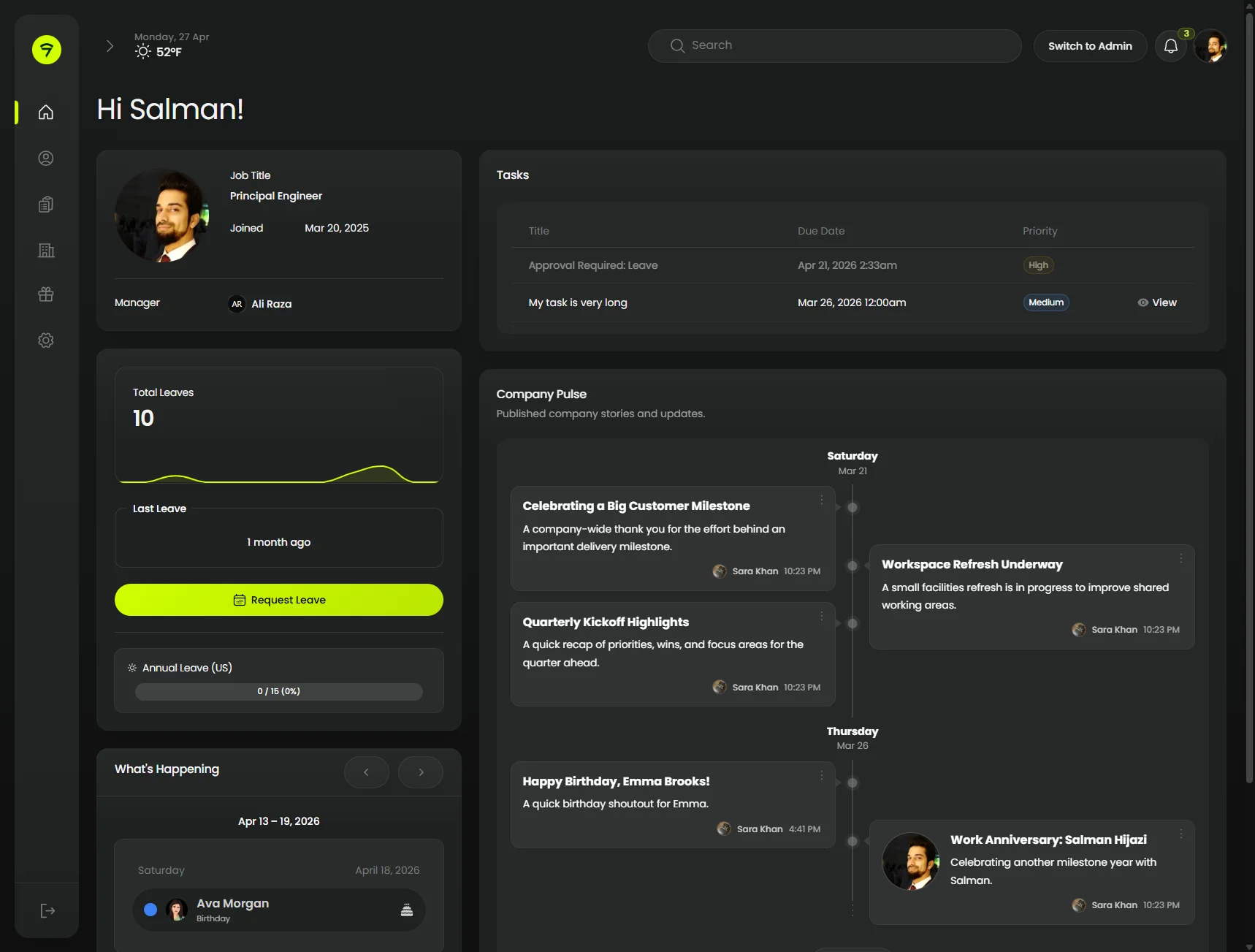
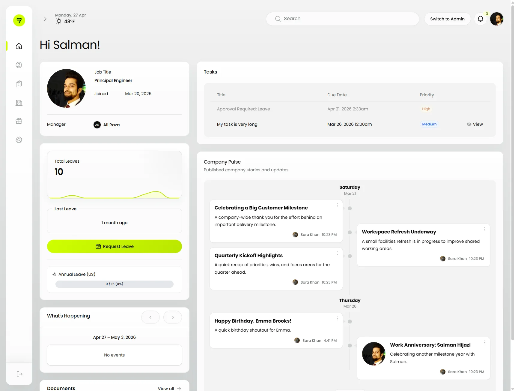
Real screens from a production HRMS panel running Orbit.
Dashboard
A composed dashboard — Orbit’s HeroCard, stats overview with sparkline, a tasks table, and an activity feed. Everything sits on one continuous canvas with the rounded sidebar detached from the body.
 | |
HeroCard in use
Acts as a profile header on resource view pages — tabs sit underneath, infolist columns to the right, and a contextual action button anchored to the top.
 |  |
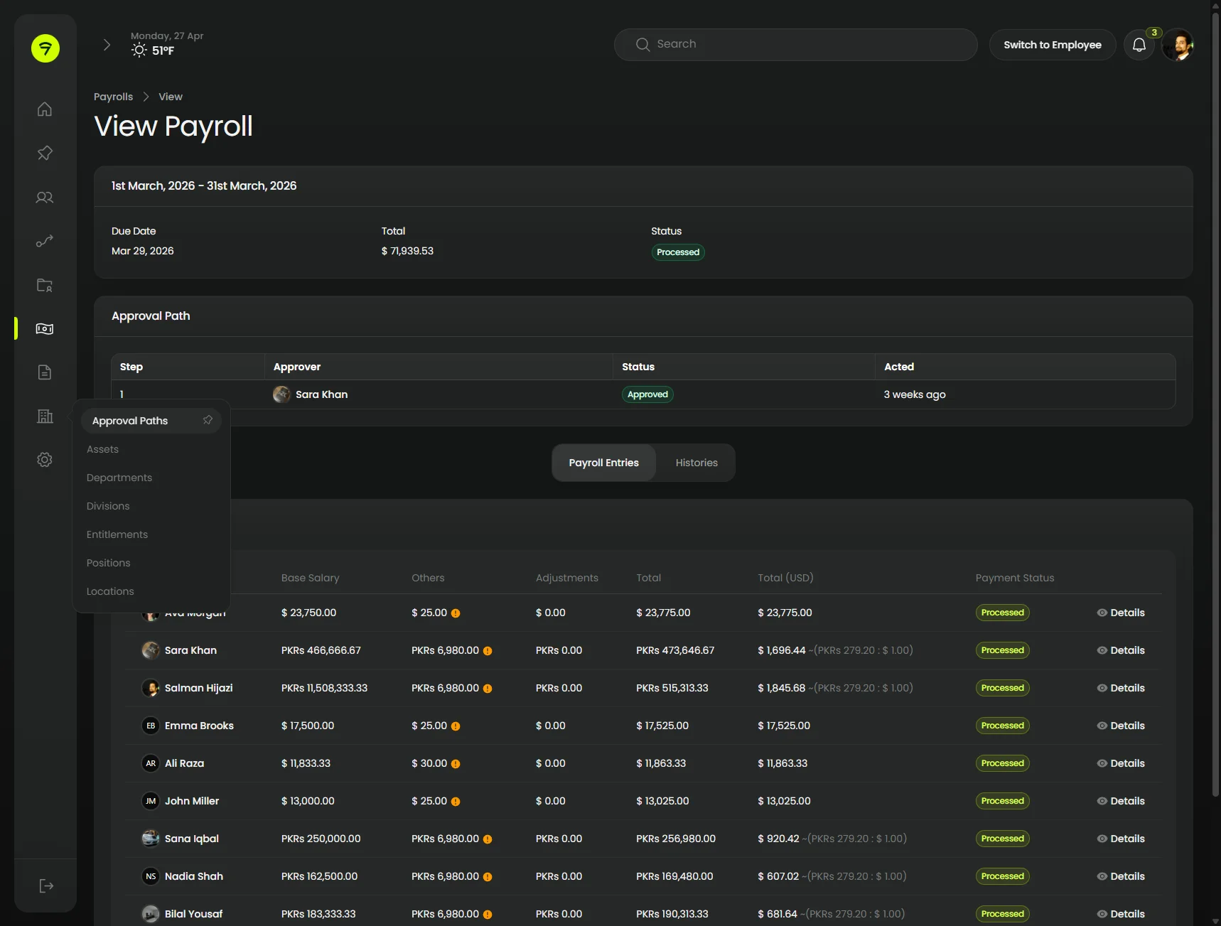
Resource detail
infolist + table + sub-nav
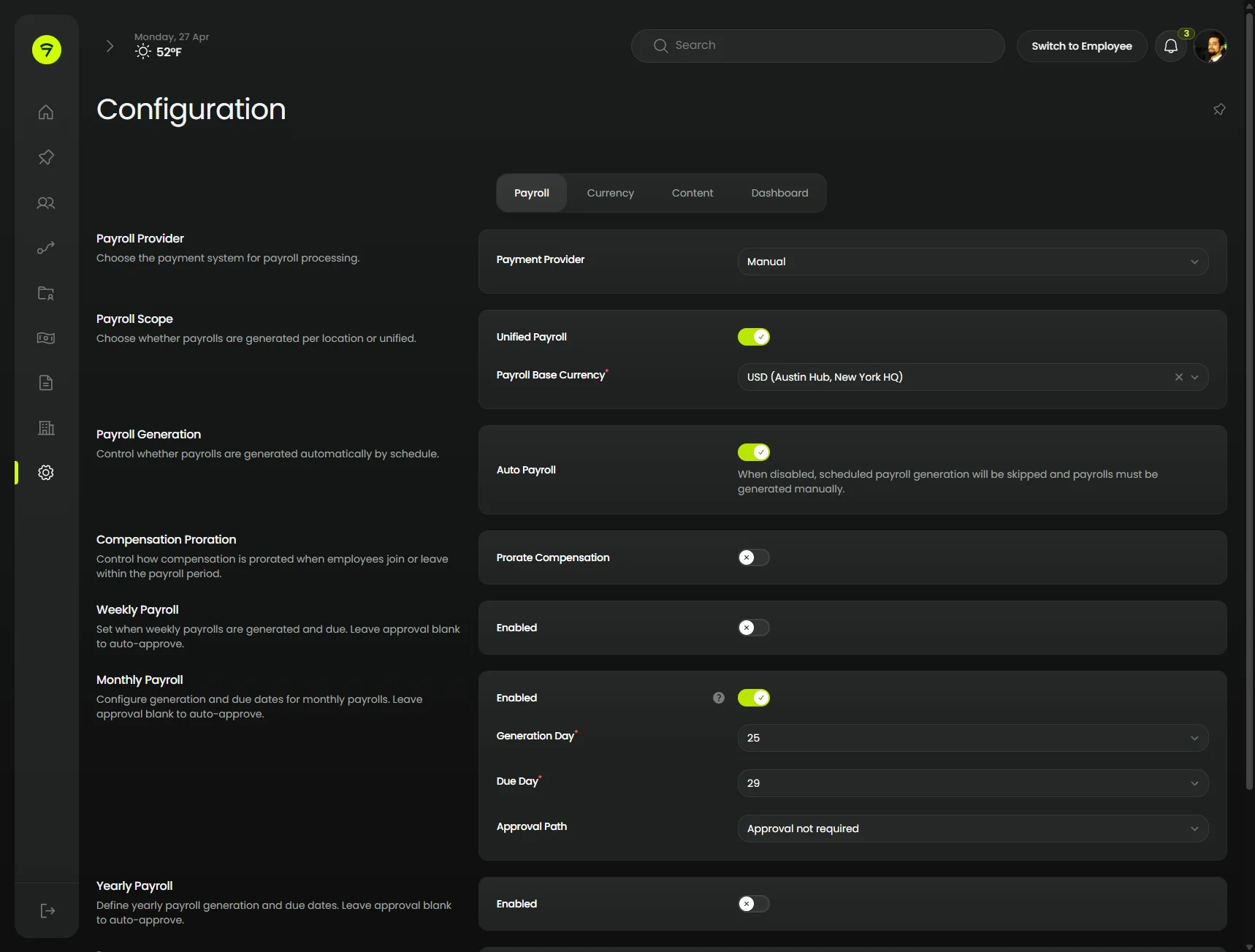
Settings clusters get a sub-navigation column on the left, dropdown groups expand inline, and the page itself stacks an infolist over an approval-path table.
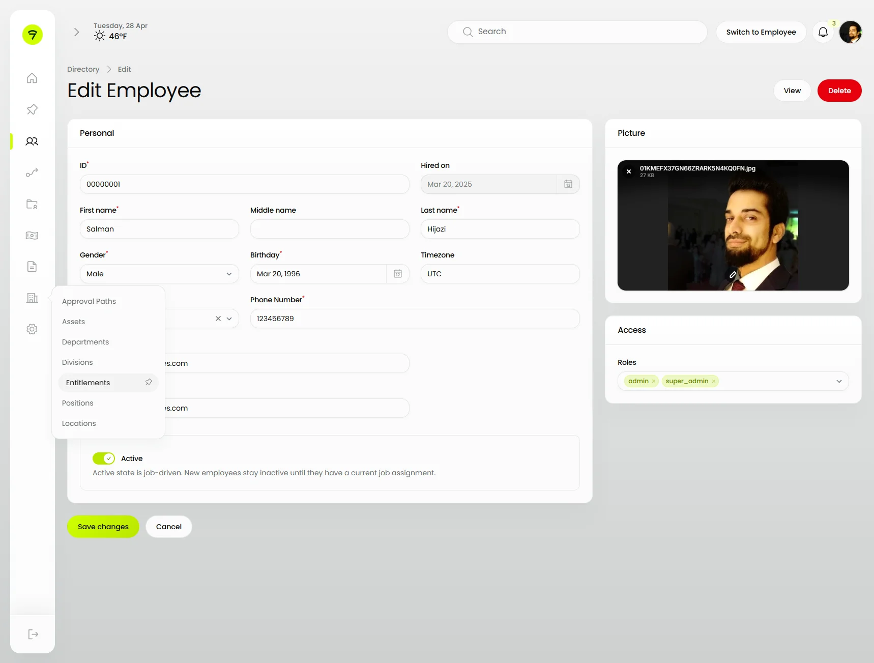
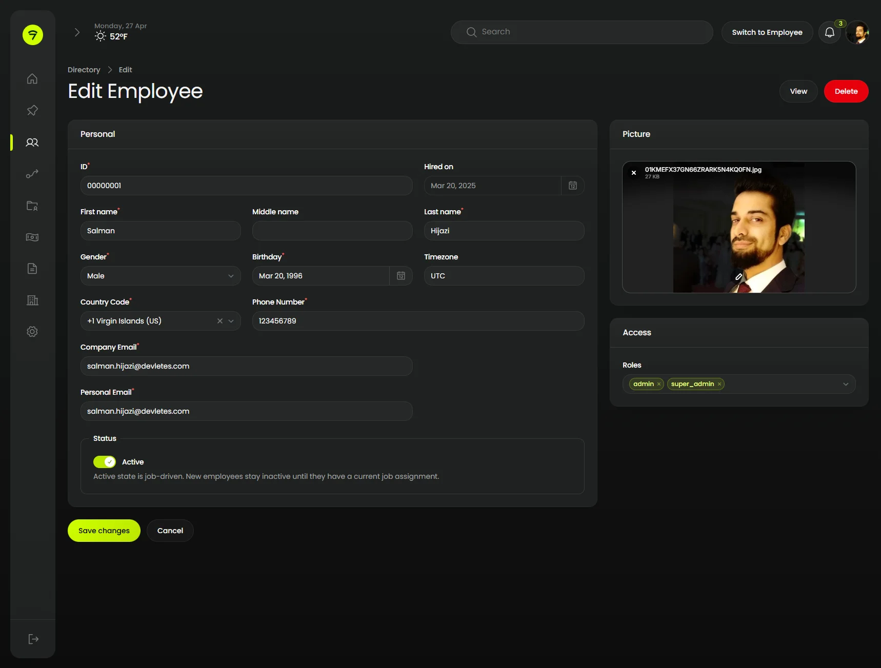
Form and Fields
A typical Filament edit form themed end-to-end — sections with soft gradient headers, an aside column for ancillary fields, and a primary-tinted save button. The light-mode shot also shows a cluster sub-nav dropdown opening over the form.
 |  |
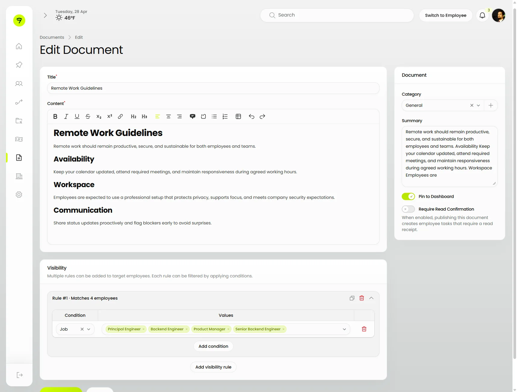
Text Editors
Rich editor toolbar adopts the same chrome as the editor body, an aside column floats document metadata to the right, and a repeater/builder row sits below for visibility rules.
 | 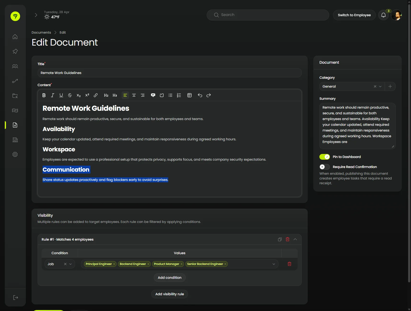 |
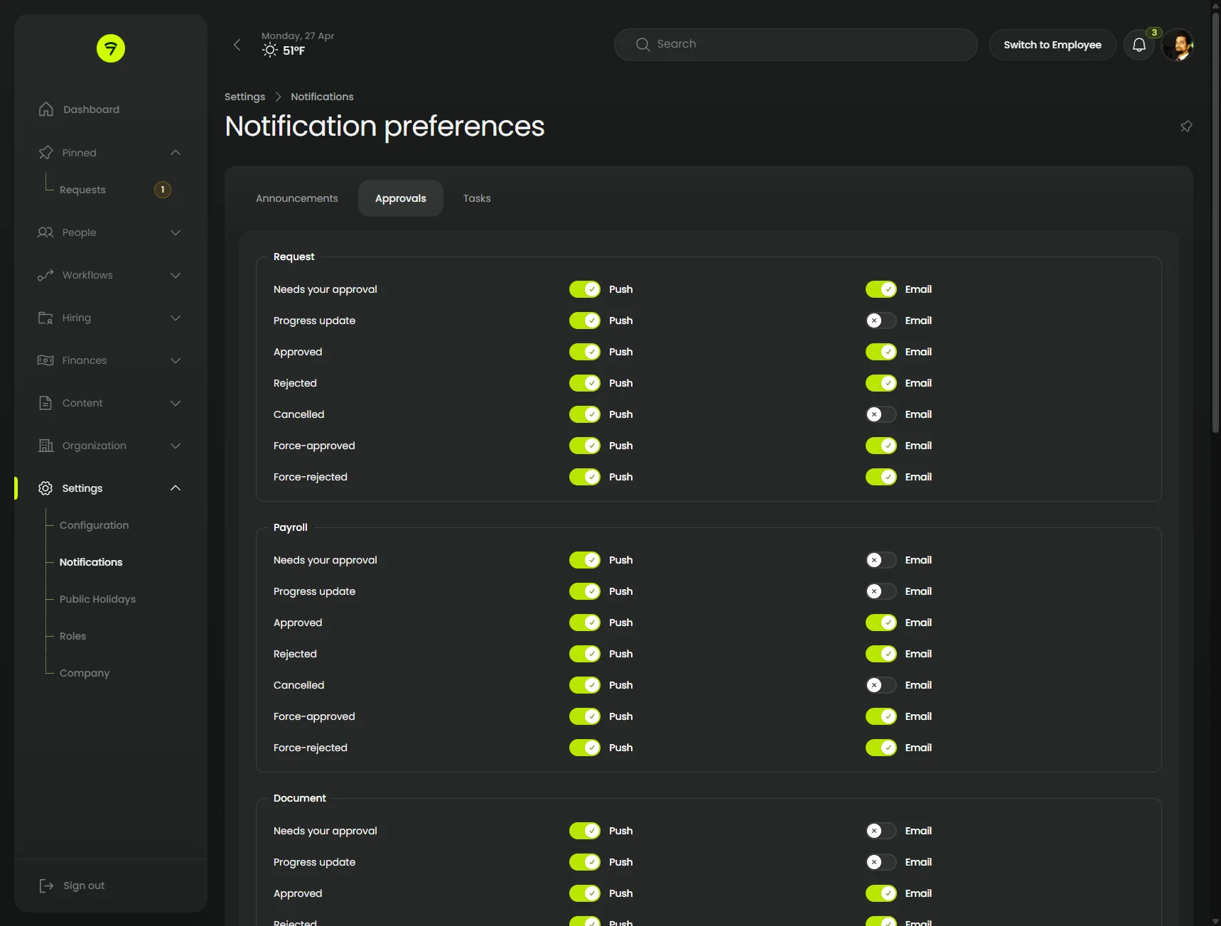
Tabs and Aside
Cluster pages with contained tabs, dense rows of toggles and select inputs, and an aside layout that keeps each setting paired with its description. The notification preferences view shows the same chrome under a deeper sub-nav.
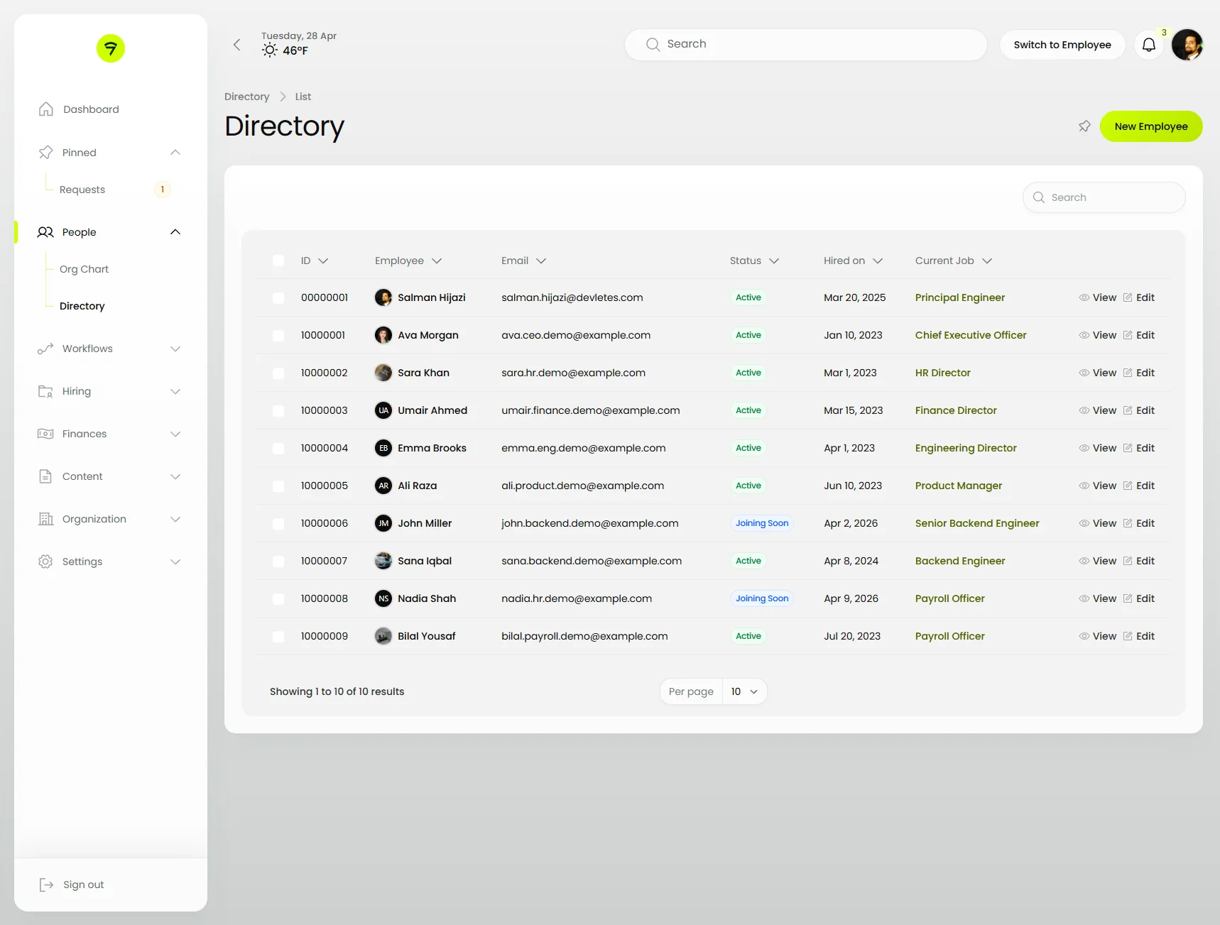
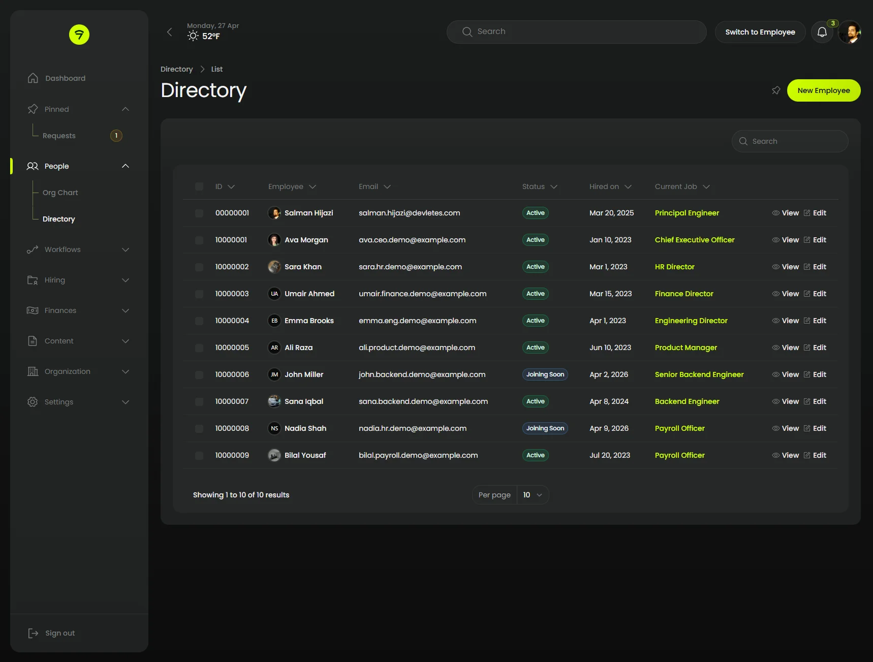
Table
The directory table with the sidebar fully expanded — pill search field, header toolbar, badge columns for status, and rounded pagination.
 |  |
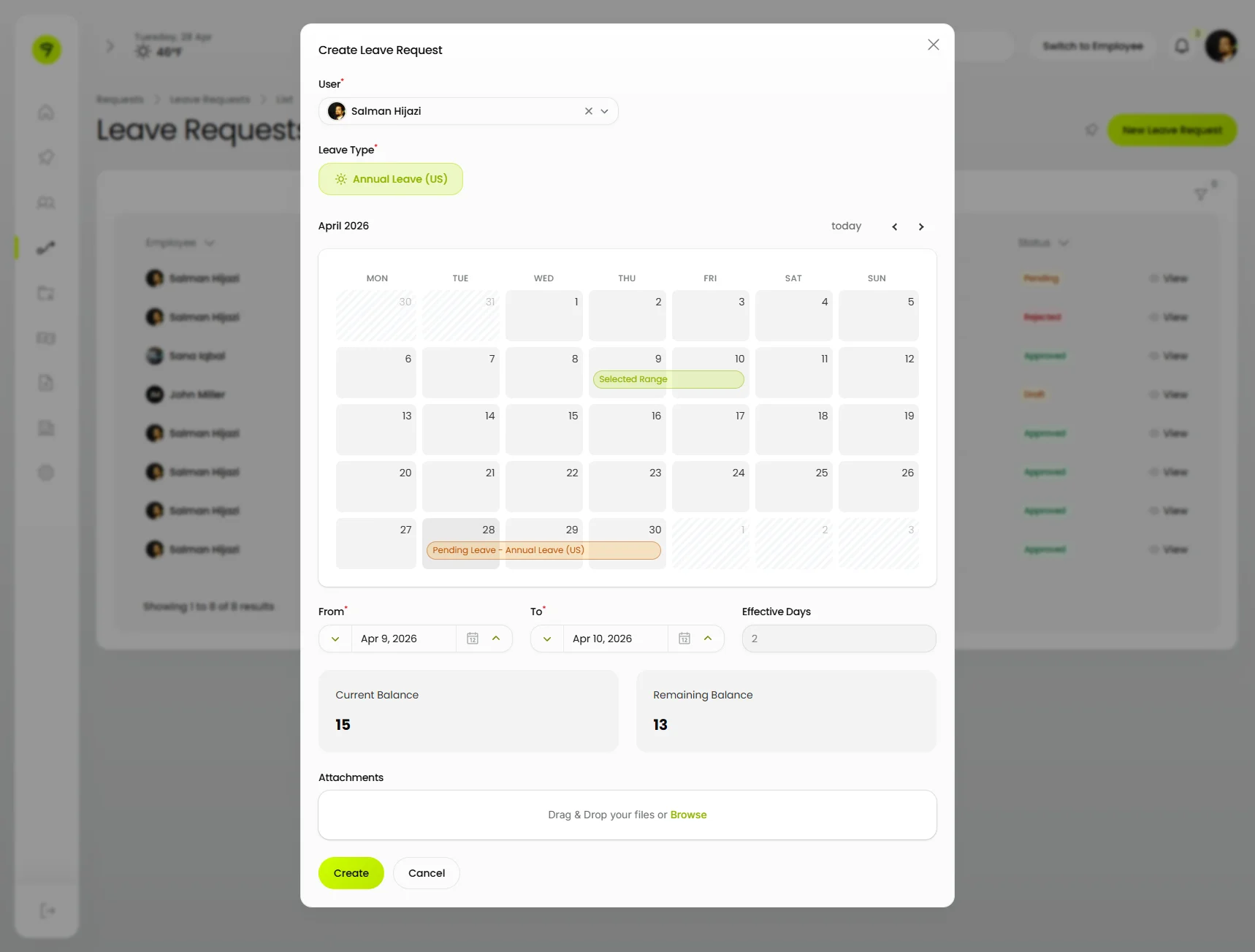
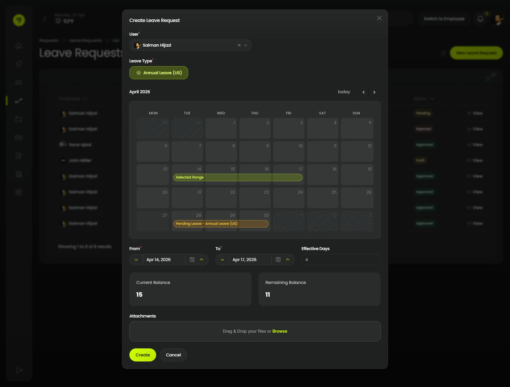
Modal with form
A multi-section modal hosting a Filament schema — relationship select, toggle buttons, an inline date-range calendar, and a file upload — all rendered in the Orbit chrome.
 |  |
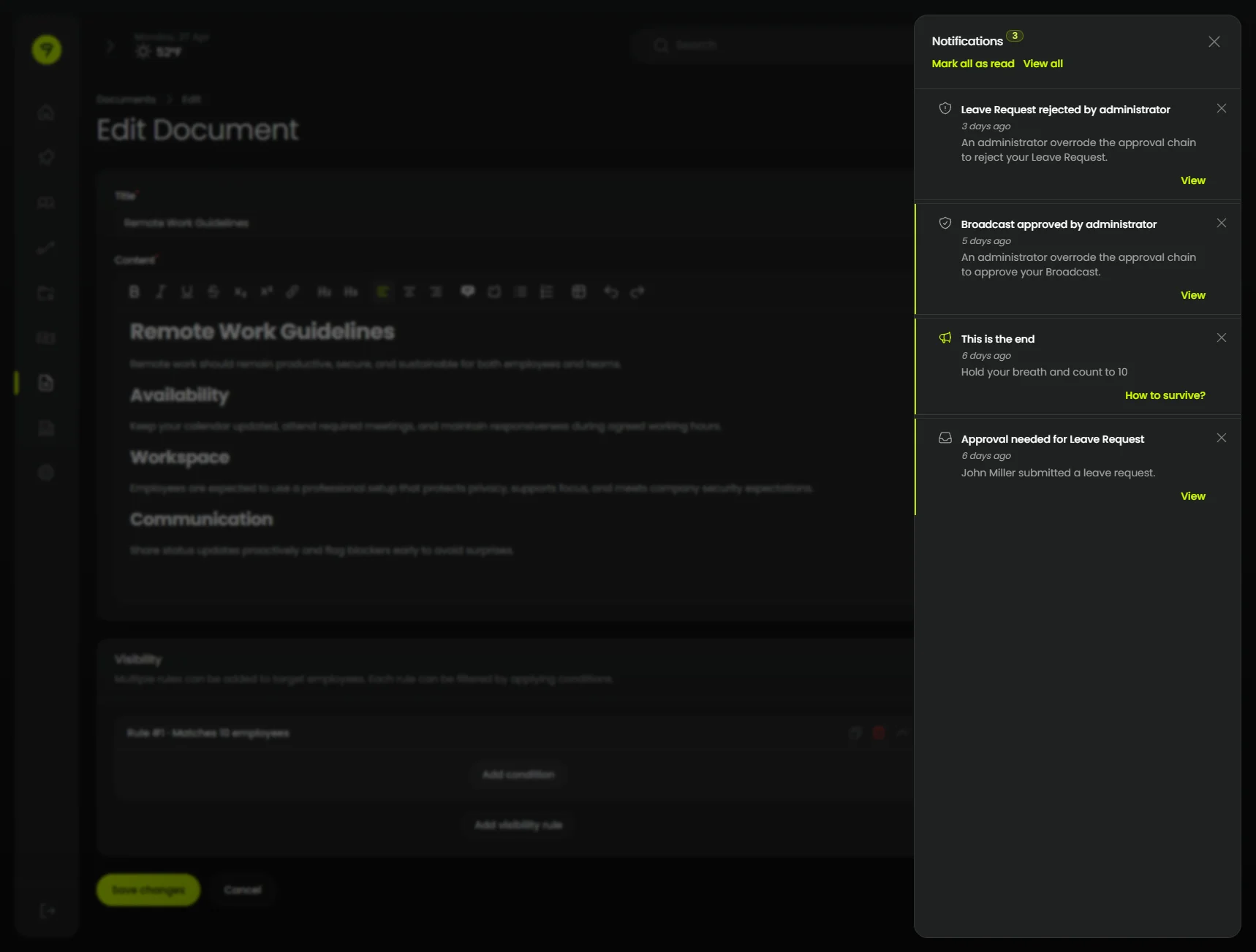
Notification Panel
Stored notifications open from the topbar bell into a slide-in panel inset from the right edge.
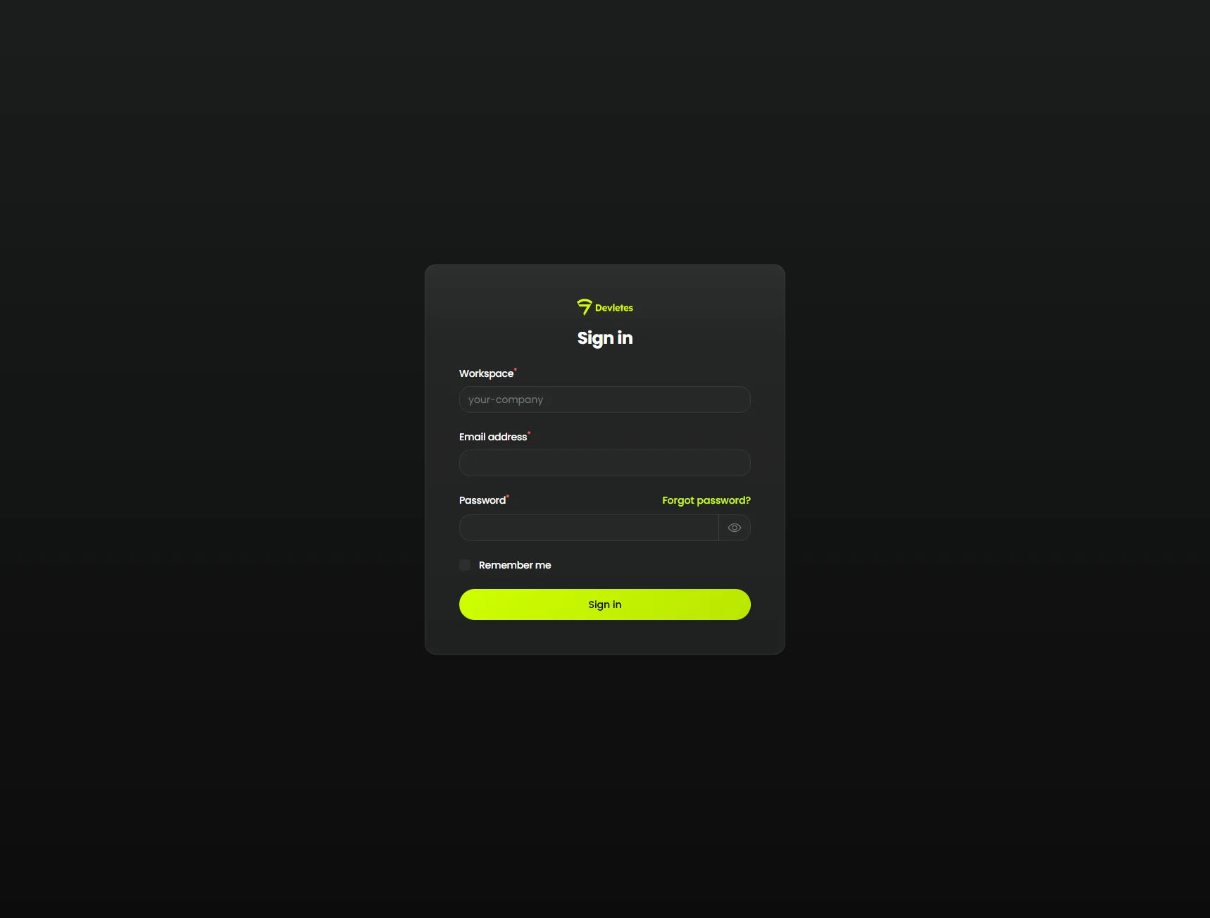
Login
Filament’s simple-page wrapper themed with the Orbit canvas, card surface, and matching primary action.
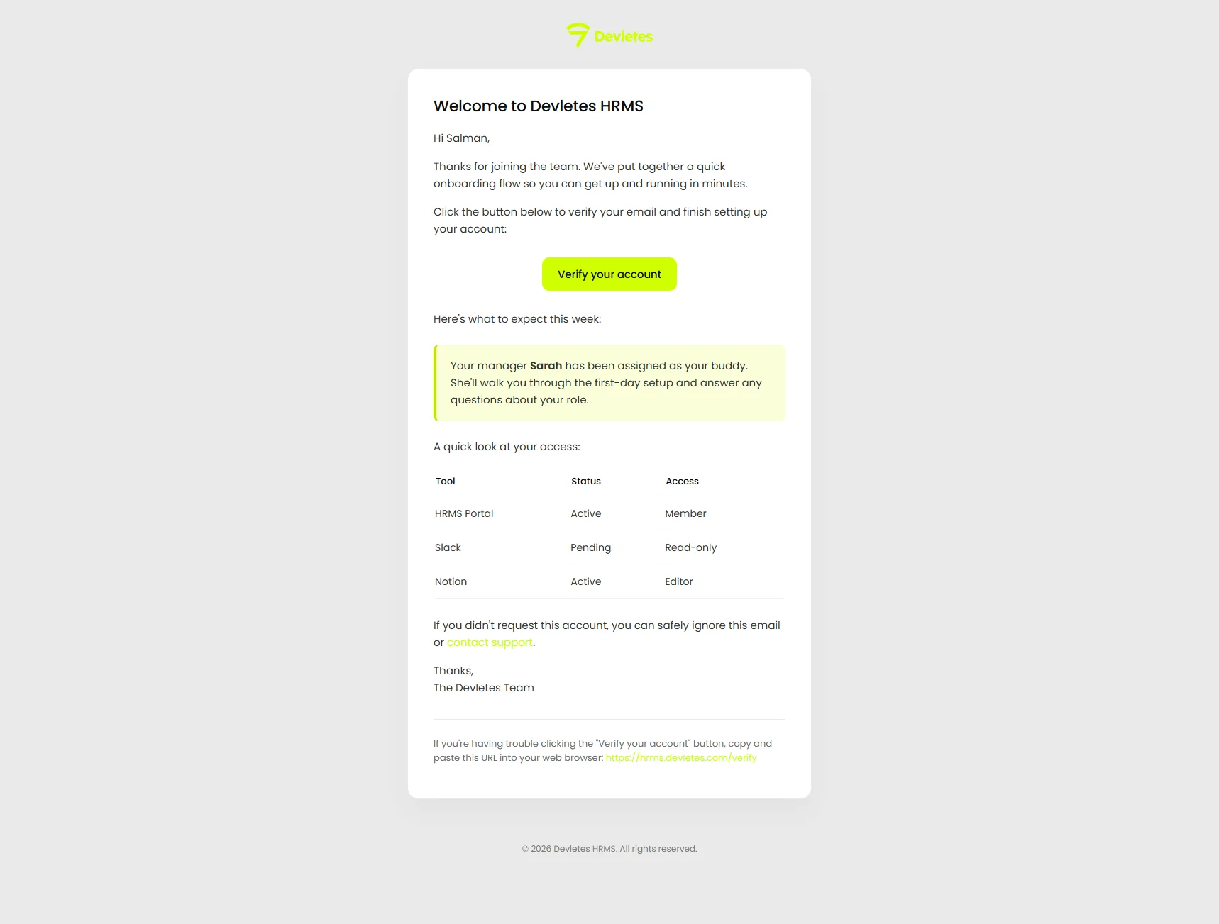
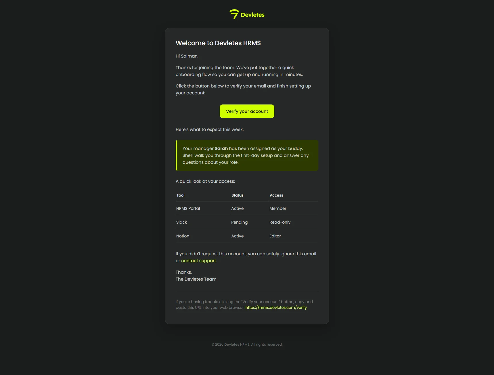
Mail templates
A sample welcome email rendered with the panel’s primary color baked in and a tenant logo set via ORBIT_MAIL_LOGO.
 |  |
License
This is a commercial product. Your license grants you the right to use this theme according to the terms of your purchase through Anystack.
Standard
- Single-site license
- 1 year of updates
- Lifetime access to the version line
- Email support
Unlimited
- Unlimited sites
- 1 year of updates
- Lifetime access to the version line
- Priority email support
Frequently asked questions
- What versions of Filament does Orbit support?
- Orbit is built and tested against Filament 5 (^5.0) on PHP ^8.2. It restyles every component Filament ships — sidebar, topbar, sections, forms, tables, infolists, widgets, modals, and notifications.
- Does Orbit support light mode?
- Yes. Orbit is designed dark-first but ships with a complete light palette out of the box, with no extra configuration.
- Do I need to import Orbit's CSS into my own Vite or Tailwind theme?
- No. Orbit registers a pre-built stylesheet via Filament's asset manager. Run `php artisan filament:assets` after installing — your app's build pipeline stays untouched.
- Can I customize the primary color?
- Yes. The plugin exposes a fluent `primaryColor()` method that accepts any 50–950 palette array, so you can match the theme to your brand.
- Is this a one-time purchase or a subscription?
- One-time. Standard ($69) covers a single site, Unlimited ($199) covers any number of sites. Both include one year of updates and lifetime access to the version line.